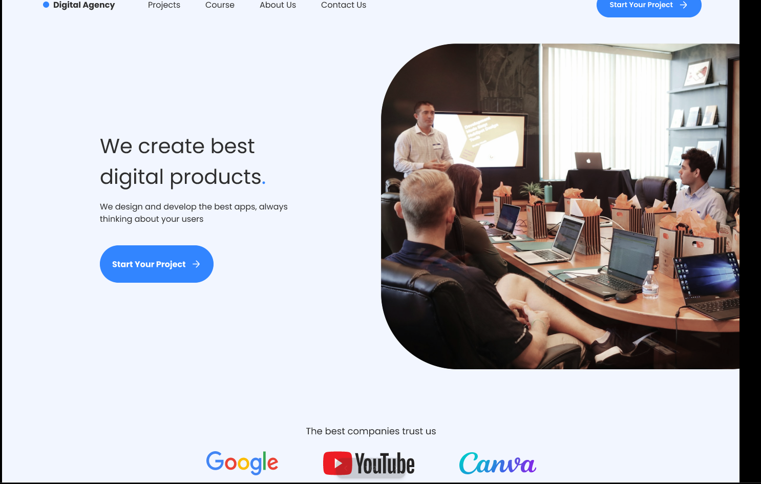
Agency Landing Page — Minimalist Luxury
A dark, premium landing page exploring layout, type and visual rhythm.
What it solves
Many agency websites feel cluttered or dated, failing to convey the premium nature of their services. This project focused on mastering a minimalist-luxury aesthetic to improve brand perception and guide users toward a single, clear call-to-action — no noise, no friction.
Key design decisions
Advanced Auto-Layout
Built the entire page using Figma's Auto-Layout so the design stays fully responsive and developer-ready — every section reflows cleanly without manual reposition work.
Typography hierarchy
Paired a bold display typeface for headings with a clean sans-serif for body copy, creating a high-contrast, professional rhythm that pulls the eye through the page.
Strategic whitespace
Used generous negative space deliberately so the portfolio work could breathe and stand out — preventing visual fatigue and signalling 'premium' without saying it.
Component-based workflow
Created a reusable UI kit — buttons, nav bars, and cards — to maintain 100% design consistency across every section and make global tweaks instant.
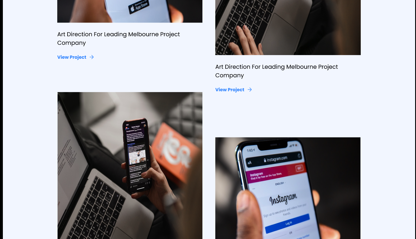
Inside the prototype

What shipped
Designed and prototyped a high-fidelity landing page in under 48 hours, with a complete dark-themed component system. The result is a calm, confident page that feels expensive — proof that restraint and a strict system beat decoration every time.
What I learned
Grids do the heavy lifting
A strict 12-column grid is the quiet secret behind an 'expensive' layout. Once everything snaps, the page feels intentional even before the type and color land.
Global styles = global speed
Setting up colour and type styles at the start meant changes that would take minutes happened in seconds. Front-load the system, ship faster later.